Welcome to the second half of our Skill Builder posts on Fabric Selection. This post will focus more on how to choose fabrics for a project. Jeanne at Grey Cat Quilts and I have split up some of the topics so be sure to check out her post as well.
One of the biggest challenges I hear from quilters, online and in person, is that they are not sure how to put fabrics together. What if they don’t go together? What if the quilt looks bad? Instead of taking a chance, many decide it’s safer to choose just three or four fabrics from the same line. They go together, right? And that’s what you want, right? Well, not necessarily.
Quilt fabric choices fall into a couple of different categories. I think of them as planned (limited fabrics from a single line or carefully selected), planned scrappy (large selection of fabrics in a limited color palette, not necessarily from the same fabric line) and scrappy (anything goes, the more the better). My quilts generally fall into the planned scrappy group, although I’ve made all three. They all have their advantages. A planned quilt is more formal. This quilt, based on the pattern Mosaic Magic from the December 2006 issue of McCall’s Quilting, uses only eight different fabrics.

The next is a planned scrappy quilt, and has over 30 different fabrics. Because they are in a very restricted color palette, it still has a planned look, hence “planned scrappy.” The greatest advantage to this sort of quilt is that you don’t have to worry about having enough of a particular piece of fabric – you can just grab a different fabric in about the same color and keep piecing. This kind of quilt is great for the fabric stasher, as you can just shop from what you already have. I am most attracted to this sort of quilt because I think it has a liveliness that a more strictly planned quilt often doesn’t.

Finally, here are some string blocks from my UFO pile:

There are hundreds of different fabrics in the blocks, and if I ever put the thing together it will be chaotic and fun. The advantage to scrappy quilts is their freedom. Forget color theory, just grab a bag of scraps and start sewing. It’s a great way to clean out your scrap bin.
You see a lot of scrappy string quilts, but any design can be scrappy. The only thing you need to think about is value placement. The design will be visible as long as the relative lightness and darkness of the fabrics is evident – but more on that later.
Color Inspiration
Here’s a phrase that some quilters find intimidating: “Color Theory.” Color Theory starts with the color wheel and introduces some guidelines about how colors relate to one another on the color wheel. Jeanne is explaining color theory in detail, so I’m not going to comment too much on that, but here are several free online color tools that can help you make use of color theory.
Color Scheme Designer – Drag the dot around the color wheel to your first hue (color, like blue, green, red, etc.). Click on the Adjust Scheme tab beneath the color wheel. Drag the dots on the two grids to adjust saturation/brightness (imagine adding black or gray to the main color, resulting in a dusty, grayish blue vs. a royal blue, for example) and contrast (widen or narrow the range of colors in the palette it provides). Above the color wheel you can choose different combinations of colors (monochromatic, analogous, complimentary, etc.) and it will display the results for you. In other words, you might start with blue, change the saturation/brightness so it is a little grayed, then choose Analogic and it will display six blues, six purples and six greens. This is a very easy to use Color Theory tool.
Color Wizard – Like the Color Scheme Designer, Color Wizard illustrates the different ways of combining colors. However, finding the right starting point is more challenging unless you have a RGB or hex code for your color. You can drag the red, green and blue sliders and then click on the color chips below to refine your selection.
If Color Theory doesn’t interest you, why not take let the professionals do the work for you? Fabric designers know their stuff, and if a print fabric really speaks to you, use it to pull other fabrics. Jeanne will go into greater detail on this one, too.
Other professional designers can help you, too. Home decorating magazines are a great resource. Pay attention to the details. This link takes you to a photo of a room at the Better Homes & Gardens website. It is decorated in shades of blue and white, but notice the touch of orange with the pillow. That orange wasn’t an accident – the designer made a conscious decision to include that color. Here’s another room, again in blues and whites, but this time with a green table. Notice the framed photo above the table – the mat leans a tiny bit toward blue, while the table is a lime green. Look at the stripes in the bedspreads – see the olive? How about the aqua stripes on the pillows? The colors don’t match, but they go together nicely. There’s one more color I want you to notice in the photo – see it? Yep, the oranges aren’t there because the set designer was hungry. That little bit of zing adds to the photo – and your quilt.
Don’t forget to look at advertisements. Old or new, as long as they have color, they have something to offer. Here’s an old Hiram Walker cordial ad with a beautiful collection of orangey pinks, aqua blues and sea greens, and a new ad for Savannah College of Art and Design in a modern palette of mustardy yellow, soft blue, taupe and vibrant orange (hmm… I’m finding a lot of examples in the same colors). The subject of the ad isn’t important, just look at the colors they’re using.
Even your cereal box can provide color inspiration. Look at this page for Kellogg’s Fiber Plus products. Chocolate brown, creamy yellow, and soft aqua, or peachy rose, or gold – any of these would make a beautiful quilt color scheme.
Photo sharing websites are a great place to look for color inspirations, but not in other quilts – look at the photos, especially photos taken by professional or semi-professional photographers. Check out this gorgeous photo, taken a few miles from where I live. I used that photo as an inspiration for my Crossed Kayaks mini quilt.

See the barn red, the soft greens of the frosty grass, the yellow green in the tree, the peachy sky?
I’m most familiar with the photo sharing site called Flickr, but I know there are many others. You do not have to have a Flickr account to look at other people’s photos. In Flickr, photographers can add their photos to groups. When you find a professional looking photo, scroll down and look at the right side of the screen. It says “This photo also appears in…” and is followed by a list of groups that the photograph added the photo to.

That’s a good way to find a group that will have a lot of professional quality photos. You can search for groups that feature specific subjects, even search for individual photos that include tags or descriptions with a particular word. Here’s a quick exercise:
Go to the Flickr page.
In the search bar, type “nature” and click Search.
Scroll down – it shows that there are over 12 million photos with the word “nature.” That’s a lot of inspiration. (You can click on a photo to see it larger.)
If you have a Flickr account, you can use the Color Palette Generator tool by Big Huge Labs. (You can use it without a Flickr account, but only on your own photos.) You will need to link to your Flickr account, and then you can choose photos from your photostream or from your favorites. It will create a palette of fifteen colors from the photo. You do not get to choose the colors and if the photo is mostly one color (blue sky, for example) the generated palette can have an overwhelming amount of that color.
My favorite color palette generating tool is Toucan, from Aviary. You can use photos from Flickr, Tumblr, Picasa, Facebook, any URL or by uploading your own photos. With Toucan you choose a photo, then use the eyedropper tool to select colors. You are in control of the colors, not the software. I talked about Toucan in greater detail, including how to use it, on a previous post.
The earlier post also talked about design seeds, a blog that posts several color palettes every day that are inspired by photos. In addition to this blog, there are several color palette sites that allow people to share their color combos. Check out Color Schemer Gallery and Kuler to start.
Fabric Selection
Okay, now that you’ve gone blind from reading all of that text about color choices, let’s get to the fun part. FABRIC!
Some people like to start with fabric and then choose a design, some start with the design and then choose fabric. I’m a design first kind of person, although occasionally I’ll see a fabric that makes we want to find a project for it. As you’ve seen, I love my EQ7. I like to draw the quilt in EQ7 first, then start playing with virtual colors and fabrics. I described the process a bit in my Double Wedding Ring decision post. That’s just the first step, though. Once I decide on the colors, I still have to choose the actual fabric. This is an illustration of the Double Wedding Ring colorway I chose:
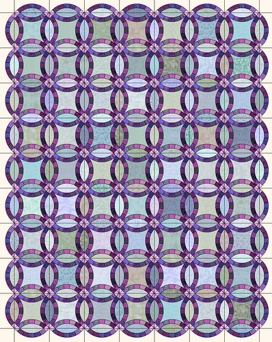
By the way, this is called an Analogous color palette, which means the colors are next to one another on the color wheel. The blues, greens and soft purples are set off by the darker purples of the rings, and the pinkish purples at the intersection of the rings.
These are the fabrics I chose:

I have a range of purples, blues and green in mostly light to medium values. The rings will be constructed of a variety of purples, although I threw a blue in there just for the heck of it. As I said before, I like a lot of different fabrics in my quilts.
Here’s the more important photo, however:

The back row shows the light fabrics that I chose for the quilt. The front row is a the fabrics I pulled but decided NOT to include. From left to right, here’s why I eliminated the fabrics:
1. Aqua with dark dot – Too bright. The fabrics I chose are softer, slightly grayed.
2. Small blue floral print – I didn’t like the quality of the fabric.
3. Medium scale light blue floral – WAY too bright and clear.
4. Light aqua circles and dots – The color is right for this, but the pattern was too distinct. I wanted the fabrics to blend together, like watercolor.
5. Aqua tone on tone with small stars – I could have used this in the quilt, but I had a lot of aquas and green already and I wanted to stay more in the blue range.
6. Darker gray/blue – This also probably could have gone in, although again the print is a little too distinctive.
7. Aqua floral tone on tone – Again, this would have worked, but I already had similar fabrics.
8. Light olive acorn print – Too brown.
9. Aqua with white flowers – Print is too distinctive.
10. Small scale blue print – Quality of the fabric wasn’t as good.
11. Greenish check – The check was too distinctive.
12. Periwinkle blue paisley – Well, that one just JUMPS out of the photo, and it would have jumped out of the quilt, too. That wasn’t the feel I wanted in this quilt.
13. Pale blue polka dot – Too light with the white polka dots.
14. Green on cream floral – Too mottled looking, not blendy enough.
As for the fabrics I did choose, you can see that colors range from a soft lilac to gray blue, to blue, to aqua and finally to green. I chose a narrower variety of values ranging from medium light to medium dark. I didn’t want a lot of light fabrics in this quilt, although there are one or two that will give me some movement. I’m relying a lot on the darker purple rings to provide the value change.
The DWR quilt is based on a very soft, blended palette. If you look at the Coin Toss quilt (which has turned into a cat hammock on my quilting frame), you can see a lot of the same colors, but with an added oomphf (that’s a technical term, by the way) of bright blue and yellow green.

Because I wanted some distinction between the fabrics, you can see several fabrics that have noticeable prints.
By the length of this post so far, you’d think that color was the only important consideration when choosing fabric. If you’ll think back to the last Skill Builder Post, however, you’ll remember that value, print and scale are also important.
Value
A quilt without value changes, regardless of the colors, will look a little flat. Remember these two illustrations?


The quilt on the right has more movement with the addition of the yellow fabric not because it’s brighter, but because it’s lighter.
Value is the single most important part of a scrappy quilt – perhaps the single most important part of ANY quilt. Not only does value change create movement in the quilt, you can create all sorts of designs just by watching your value placement. The color of the fabric literally does not matter. Check out this link for photos of quilts that use value to create pattern. If you’re familiar with the traditional log cabin block, you know that it often is made with two sides dark, two sides light. Rotating the blocks gives you literally hundreds of different setting options. My Neapolitan quilt is a variation of a log cabin:

Here are some EQ illustrations of a couple of different settings. They use the same blocks, but by rotating them different patterns emerge because of the placement of the values.


Any block that is divided diagonally into light and dark halves can take advantage of these setting options. The red, white and black quilt, above, could become hundreds of different quilts using exactly the same blocks. It’s all about value placement.


Print and Scale
Most of the illustrations above dealt with fabrics that appear to be essentially a single color (tone on tone, or read as solids). When you use a multi-color print, however, you need to be aware of your companion fabrics. Look at the background of the print fabric – will it blend with the fabrics next to it, making the lines of the quilt design blurry?


Maybe that’s the look you’re going for – remember, this isn’t a right or wrong situation. The point is learning how different fabrics will work together, and deciding whether they will create the look you want to achieve. When it comes to putting fabrics together in your quilt, work with what YOU like. I can give you a thousand different ways to choose fabrics and colors, but the bottom line is that it must speak to YOU.
White, grey and black companion fabrics are very popular right now, but don’t be afraid to try something a little different. Think about how the solid fabric interacts with the colors in the prints. Here it is in navy and red.


See how the red almost blends with the red zigzag lines? Also, the right seems to advance, making the pinwheels red and the “background” the two prints. Even though the navy isn’t present in either of the prints, it provides a solid contrast. Also, it recedes, so the navy is the background and the prints form the pinwheels. That’s important to remember, actually – warm colors tend to advance and cool colors tend to recede. So if you want something in the background, don’t make it a bright orange!
Let’s try some pink options. The first is a pink that is very close to the pink in the prints. The second is much darker, and the third is much lighter.


Again, see how the intensity of the pink changes the way you perceive the pinwheels? The very light pink recedes so the prints form the pinwheels. The dark pink comes forward, and the pink pinwheels are more noticeable than the prints. The medium pink blends more – the pink is about the same shade and depth of tone as the colors in the prints.
You’ll notice I paired these prints with a solid fabric. You can put them with another print that looks solid and get a similar effect. If you’re really bold, you can pair prints with prints. You will not see the pattern of the quilt design when you do this, though, unless the values are extremely different.
Okay, I’m running out of steam here! The four posts between Jeanne and I have covered a lot of info about fabric selection, but is there anything specific we didn’t address that you’d like answered?

Wonderful. I hope some of the beginning quilters find their way here. All you ever wanted to know about quilting. A great asset to the internet. Thank you.
Thanks for doing it. I find the mock-ups you’ve made really helpful.
Wow! That’s a lot of info to take in and I haven’t read the other post yet! I love the information and your examples. This was just the kind of thing I needed to help me design my most ambitiously colored quilt yet. I’m making a fish quilt that shades from light to dark and has many colored fish. The ones I first sketched out on the computer looked awful but I think you’ve given me some ideas on the direction I should head.
great lesson!!
Great information, and the first quilt is a winner!
Love the black and red too, and especially love the different settings.
Judy B
I am a beginner (quilting for less than 6 months), and I really appreciate all the helpful information and insight!
Your skill builders series is great. I’ve helped many new quilters over the years and appreciate your photos and explanations. Now I know where to “send” the newbies when they have questions. Thanks
I am definitely a planned scrappy girl. 🙂
Rebecca is running a Quilting 101 series of posts at her blog Chasing Cottons. She has a basic “Choosing Fabric” post here:
http://chasingcottons.blogspot.com/2011/04/week-1-fabric-fabric-fabric-and-massive.html
At the end of the post she has a spot for people to link up posts they have done on choosing fabrics. I thought about your posts immediately. I think they would make a great contribution to the discussion.
I re-read the color lessons again before my trip to the quilt shop yesterday. I’ve been exposed to copious amounts of fabric all my life but yesterday, I perceived fabric differently while shopping. No longer did the flashy awe-inspiring designs and colors (not always easy to coordinate) pre-Skill Builder posts woo me. I was drawn to the stash builders. My brain categorized each color as I studied them bolt for bolt, noting them in the various categories; light to dark, small to large scale, and envisioning in my mind’s eye the shape cut outs you illustrated in your lesson. I could almost sense my brain clicking along as I checked off the 5 factors when auditioning fabrics for a project…color-check, value-check, print-check, scale-check, quality-check and double check. I made mental notes, written notes, and snapped pictures with my phone. I was transcended to a new dimension. After 40+ years of sewing, I am a new woman in the fabric store..nearly squealing with delight because I have a new passion for fabric! (as if I needed a reason….but now I have purpose.) Thank you.